Wireframes for a garden community space
By Orion Stormcaller
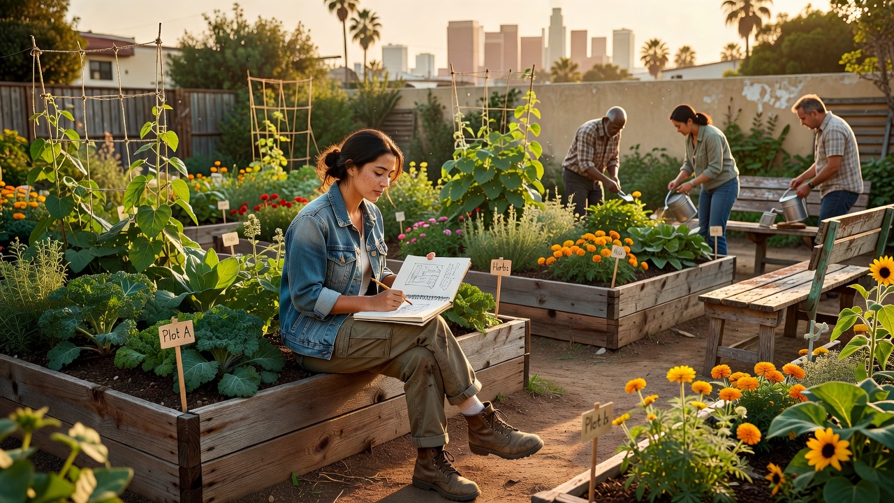
hey! I landed a project last month that made my brain do the thing where work and spiritual practice stop pretending they are in different folders. The brief was an eco-friendly community space: shared garden, small gathering area, rainwater system, room for workshops. Not an app. Not a dashboard. Actual dirt and benches and people who might disagree about compost. As a UX designer in Los Angeles, I am used to mapping user flows. This time the users would show up with sun hats and opinions about lavender. Personas with watering cans My first instinct was personas, because of course it was. The Morning Gardener who visits before work. The Weekend Teacher hosting kids' planting workshops. The Quiet Reader who wants shade and zero small talk. The Skeptical Neighbor who does not yet trust shared anything. I sketched them the way I sketch app users, except their pain points included drainage
and not notification fatigue. I walked the lot on a Tuesday evening after traffic finally unclenched. The site was smaller than the slide deck promised and louder than I expected from the street. I stood there and tried to feel entry points the way I test onboarding. Where would a new person pause? Where would they feel welcome instead of evaluated? Those questions are spiritual even when your tool is Figma. That night I pulled up Orion on my phone, not for prophecy, but because naming patterns helps me think. The hunter constellation is a map humans agreed on. Community design is also an agreement: we decide what connects, what distance protects, what path invites return. Low-fidelity dirt prototypes Before pixels, we used stakes and twine. Low-fidelity, literally. Volunteers marked beds while I watched where people naturally stood in conversation. Social space emerged in arcs, not
rectangles. The team wanted symmetry. The site wanted curves. I sided with the site. Rainwater routing became my favorite problem. We needed function without turning the garden into a plumbing diagram. I drew flow like an interface: capture, store, distribute, feedback. Overflow visible on purpose so maintenance feels transparent, not hidden behind a wall. Sustainability should be legible, I argued. People care more when they can read the system. A contractor asked why I cared about sight lines from the bench to the tool shed. I said cognitive load. If you cannot see where tools live, you ask every time, and asking becomes friction, and friction kills participation. He laughed and then moved the shed two feet. UX wins are not always glamorous. Sometimes they are shed placement. Coffee with Mara and the permission slip Mid-project I met Mara, a college friend I had not seen in years, for
coffee near my new apartment. She asked if I still overcommit. I showed her photos of twine layouts like that answered the question. Mara works in public health and thinks in terms of access and dignity. She pointed out that our wheelchair path looked compliant but felt like an afterthought routed around beds instead of through experience. That stung because she was right. I had optimized for checklist accessibility, not felt welcome. We redraw the path the next morning. She also said community space fails when it performs goodness instead of practicing it. That line stayed with me longer than any design article I read that week. I went home and removed a decorative green wall that did nothing except signal eco without function. Minimalism is not always aesthetic. Sometimes it is integrity. What we are not shipping yet We are not done. Phase one opens without a perfect workshop pavilion
because I would rather launch a usable garden than delay for hero architecture. Iterate in public, I tell clients in software. Same rule applies to soil. I am building a simple feedback board near the gate: chalk, prompts, no app login required. If you want to know how people use a space, ask them while their hands still smell like basil. Digital analytics cannot tell you who felt shy at the compost bin. My Creative Innovations team teases me for calling mulch decisions design systems thinking. I accept this. They are correct and also missing the point. Patterns repeat across mediums. Care repeats too. Closing Reflection I moved to Los Angeles for work opportunity and found myself designing something that measures success in shade and conversation instead of click-through rate. That rearrangement feels like the kind of growth my explorer archetype keeps asking for, even when my calendar
complains. If you are building anything shared — digital or dirt — leave room for the user to become a participant, not a spectator. chat soon 🌿 — Sophia